Selecting paint colours for your home doesn’t have to be overwhelming. By using the colour wheel and following a few basic design principles, you can create a space that is stylish, balanced, and uniquely yours. This guide will help you understand how to use the colour wheel to achieve beautiful combinations, followed by the popular 60-30-10 rule for applying colours in a room.
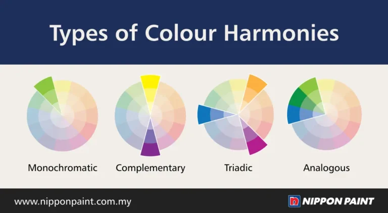
Understanding the Colour Wheel
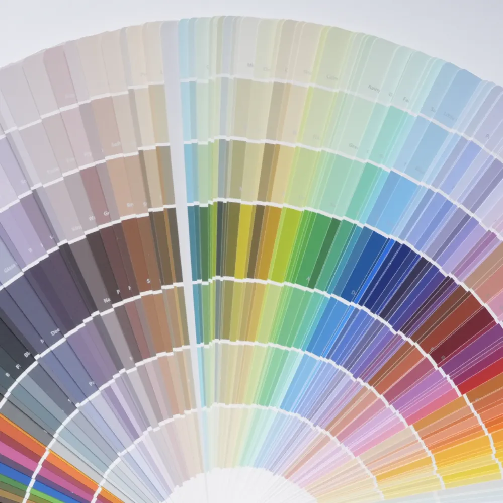
The colour wheel is a tool that helps you see how colours relate to each other, making it easier to find combinations that work well together. Here are some popular ways to use the colour wheel to create a cohesive look in your space:
i) Monochromatic Scheme
A monochromatic colour scheme uses different shades, tints, and tones of a single colour. For example, if you choose blue as your base colour, you might use a deep navy for the main walls, a softer sky blue for trim or accents, and even lighter blue accessories like cushions or rugs. This approach creates a cohesive and calming atmosphere, making it ideal for bedrooms or relaxation areas.
ii) Complementary Scheme
Complementary colours are opposite each other on the colour wheel, such as blue and orange or purple and yellow. When used together, these colours create a bold, eye-catching contrast. For instance, if you have an orange accent wall, you can add blue cushions or artwork to add a pop of contrast. This scheme is great for adding energy and vibrancy to social spaces like living rooms or dining areas.
iii) Triadic Scheme
A triadic scheme uses three colours that are evenly spaced around the colour wheel, such as red, blue, and yellow. This combination creates a lively, balanced look. For example, in a child’s playroom, you might use a yellow wall, blue furniture, and red accents in toys or cushions. By keeping one colour dominant (like yellow on the walls) and using the other two more sparingly, you maintain harmony without overwhelming the space.
iv) Analogous Scheme
Analogous colours sit next to each other on the colour wheel, like blue, blue-green, and green. This scheme offers a harmonious, subtle look because the colours blend naturally. For example, in a bathroom, you could paint the walls a soft blue, add green towels, and use blue-green tiles. This combination feels calming and cohesive, making it ideal for spaces where you want a relaxing atmosphere.
Using the colour wheel in this way allows you to experiment with different styles and moods for each room. Whether you want a bold look with complementary colours or a peaceful vibe with an analogous scheme, the colour wheel can guide you in making choices that fit your taste.
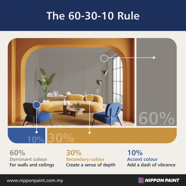
The 60-30-10 Colour Scheme Rule
Once you’ve chosen your colours, the 60-30-10 rule can help you apply them in a balanced way throughout your room. This rule involves dividing your colours into three main proportions: 60% for the main colour, 30% for the secondary colour, and 10% for the accent colour. This method creates a visually pleasing look without overwhelming the space.
How It Works:
i) 60% Main Colour
This is the dominant colour that covers most of the room. It’s typically used on large surfaces like walls and ceilings. For example, in a living room, you might choose a soft grey or cream for the walls, which makes up about 60% of the room. This colour sets the overall tone and provides a neutral backdrop for other colours.
ii) 30% Secondary Colour
The secondary colour adds depth and is usually applied to medium-sized elements like furniture, curtains, or rugs. In the same living room, you might have a deep blue sofa and blue-grey curtains that cover about 30% of the visual space. This secondary colour complements the main colour, adding interest and balance without overpowering the room.
iii) 10% Accent Colour
The accent colour is the final touch, adding a pop of contrast in smaller decor pieces like cushions, artwork, or vases. In the living room example, you might choose a vibrant yellow or orange for cushions and decorative items. This 10% accent creates focal points, adding warmth and personality to the space.
Tips for Using the 60-30-10 Rule
Stick to Three Colours Limiting your palette to three main colours keeps the room cohesive and prevents it from looking too busy.
Adjust for Personal Preference You can modify the proportions based on your taste. For instance, you could try 70% for the main colour, 20% for the secondary colour, and 10% for the accent. For a darker look, consider 60% dark, 30% medium, and 10% light.
Coordinate with Existing Decor Think about the colours of your furniture and accessories when choosing your 60-30-10 colours to ensure harmony throughout the room.
Use the Colour Wheel as a Guide The colour wheel can help you pick complementary or analogous colours to use within the 60-30-10 framework, allowing you to achieve a cohesive look.
By using the colour wheel to choose complementary or harmonious schemes and applying the 60-30-10 rule to balance them, you can transform any space into a beautifully styled room. Whether you’re aiming for a serene monochromatic scheme or a lively triadic look, these tools will help you create a space that feels polished and inviting. Now you’re ready to take on your home design with confidence, using colour as your guide.
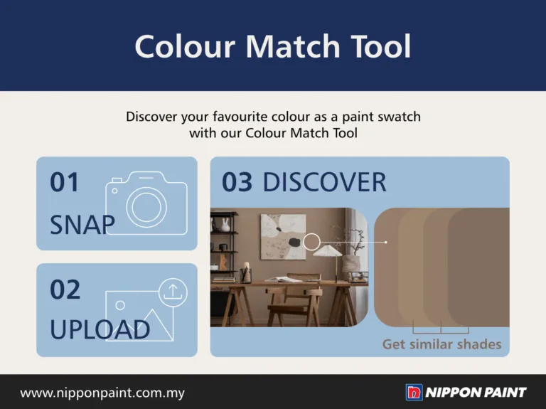
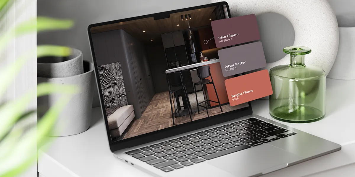
See a colour you like in real life?
Snap, upload, and Colour Match! Take a picture and upload it to our Colour Match tool to identify the closest Nippon Paint colour that it matches.