marsh marigold
YO 1156D
red apples
AC 2075A
brown bailey
AC 2141A
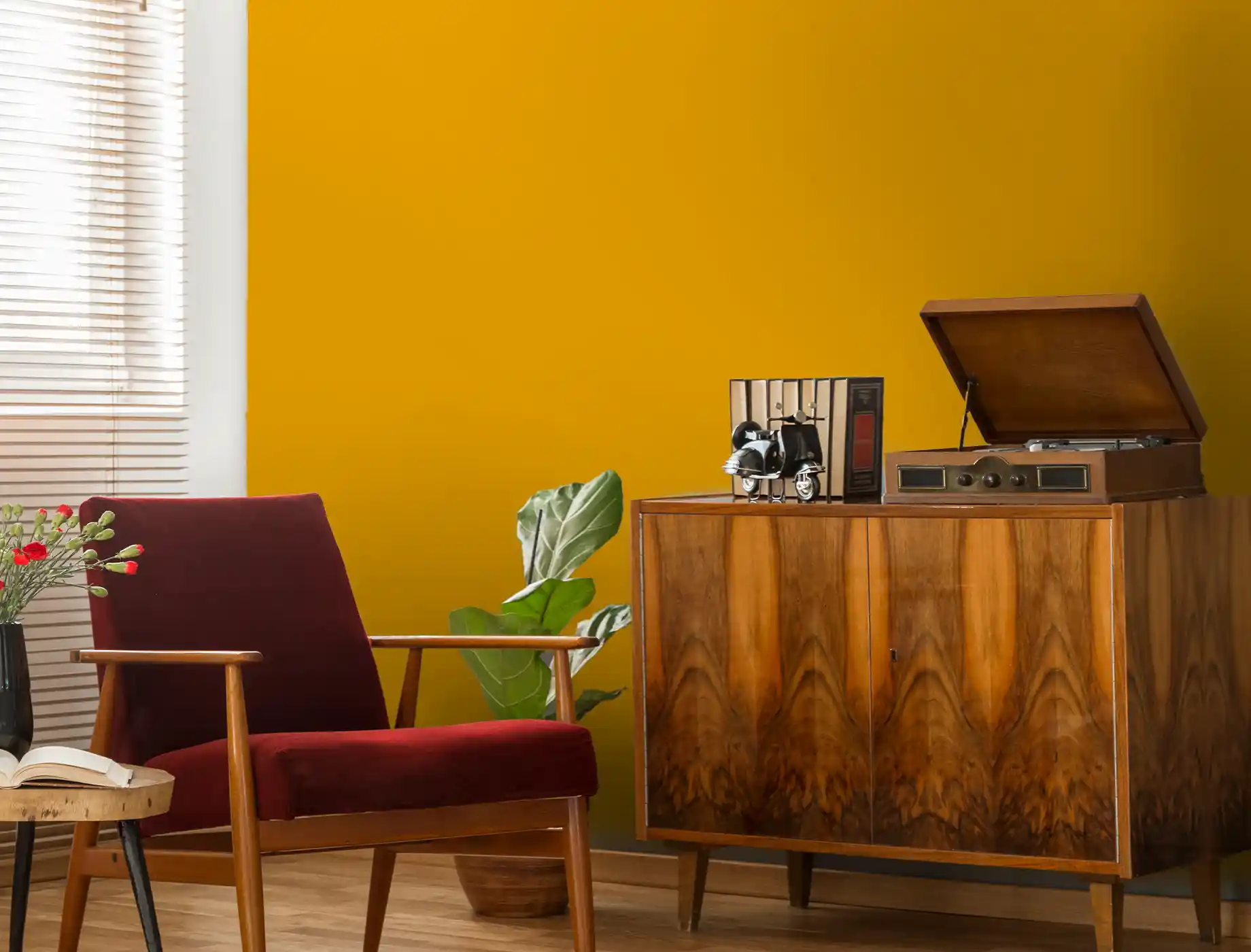
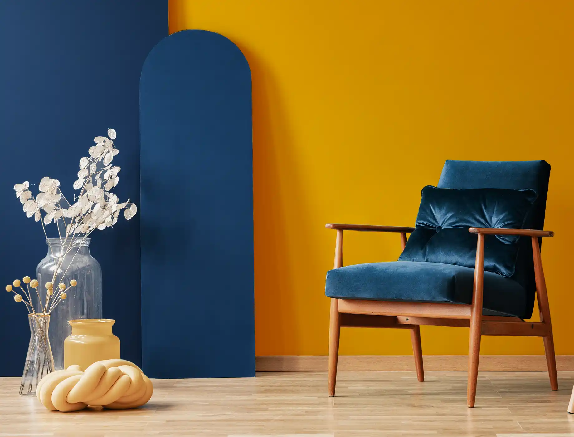
capitol's gold
YO 1169D
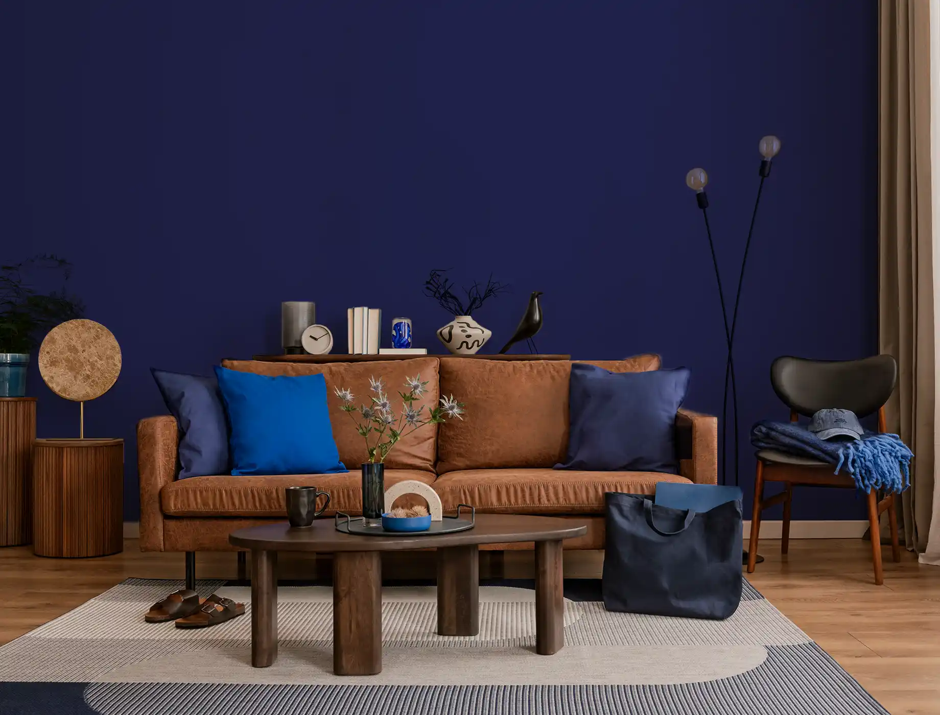
River Port
BGG 1805
Sunbaked
YO 1233D
mandarin magic
1169
cactus cooler
0444
olive overture
1854
gardenia
OW 1077P
New Terracotta
AC 2144A
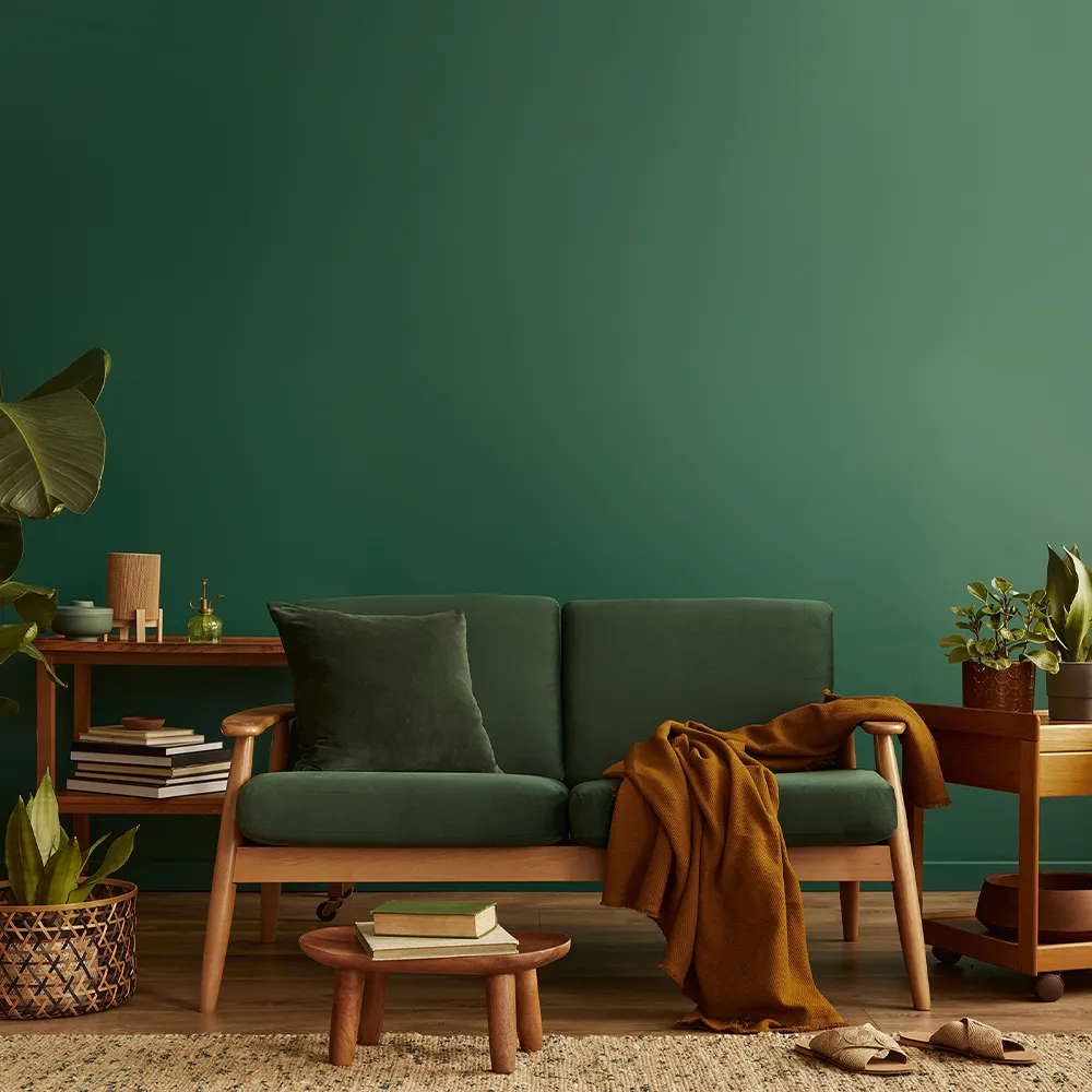
Green Hills
BGG 1765
Birch Patina
N 1852P
Burnt Amber
R 2378A
Diving Pool
BGG 2769
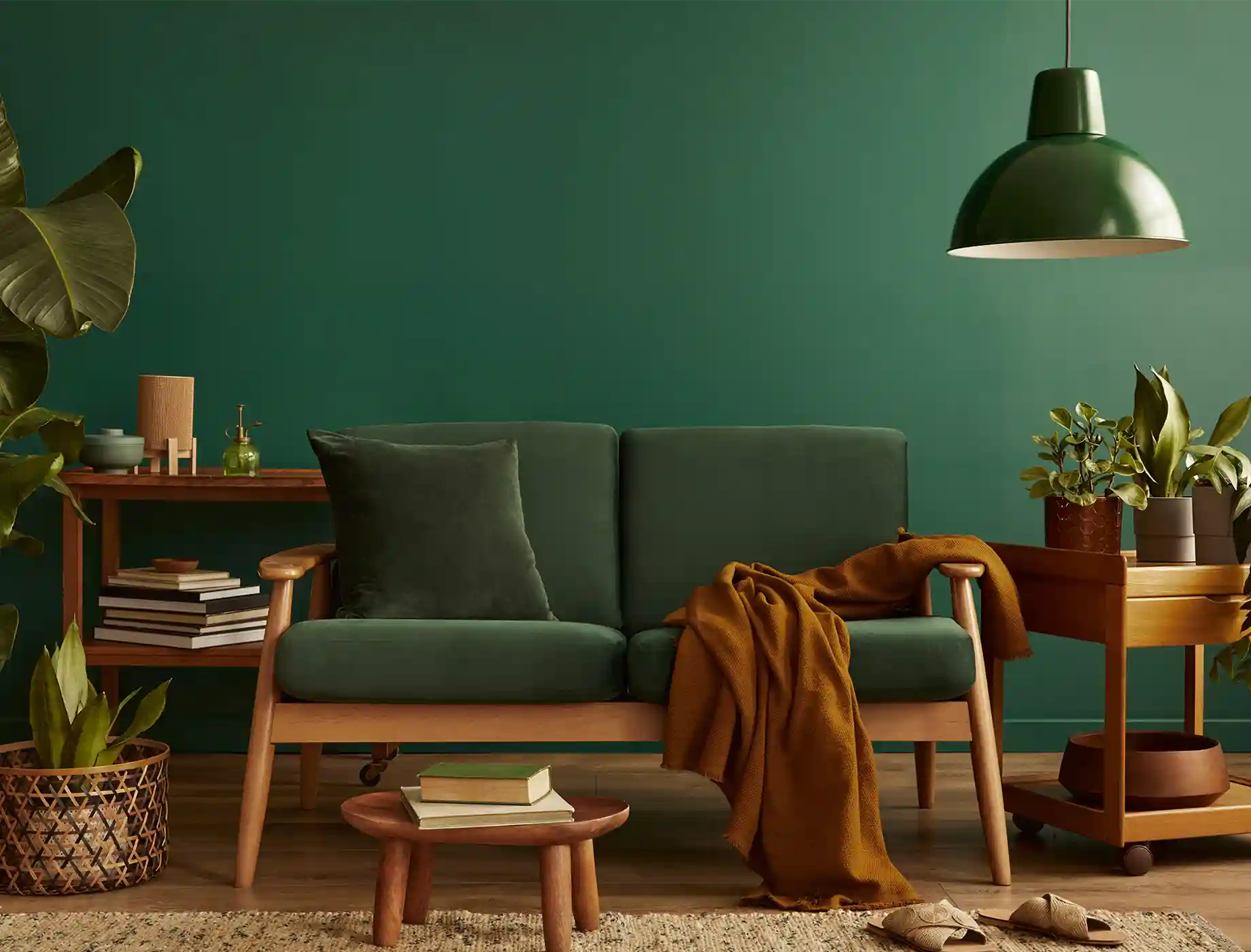
Green Abyss
BGG 1799
Caramel Twist
AC 2139A
Berry Scent
green hills
BGG 1765
honey caramel
violet whisper
OW 1085P
rhapsody
AC 2094A
caramel twirl
AC 2140A
new terracotta
fluid blue
AC 2101A
deep safron
AC 2051A
nude shades