ruling royalty
PB 1457D
gray drops
OW 1087P
wispy bits
N 1859P
orinoco
PB 1445P
heather bunch
PB 1438P
sunkissed tomato
YO 2403A
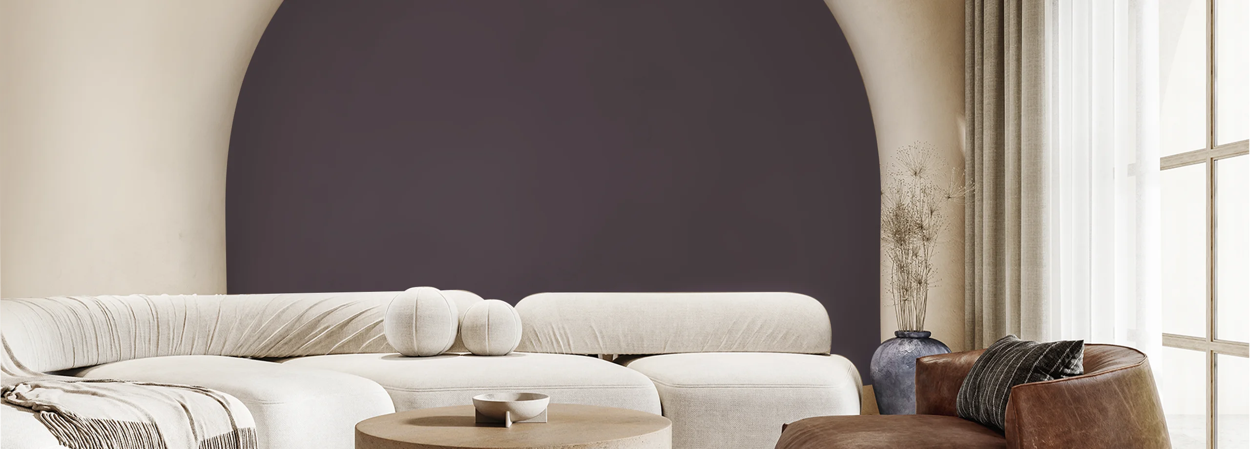
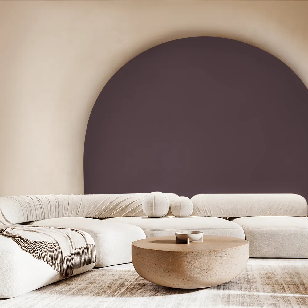
painter's attic
PB 1429D
brown bailey
AC 2141A
pitter patter
ophelia's song
PB 1430P
cloud formation
N 1971P
soft melody
PB 1439P
bare toes
OW 1025P
brodeau brown
PB 1428A
brown bailey
AC 2141A

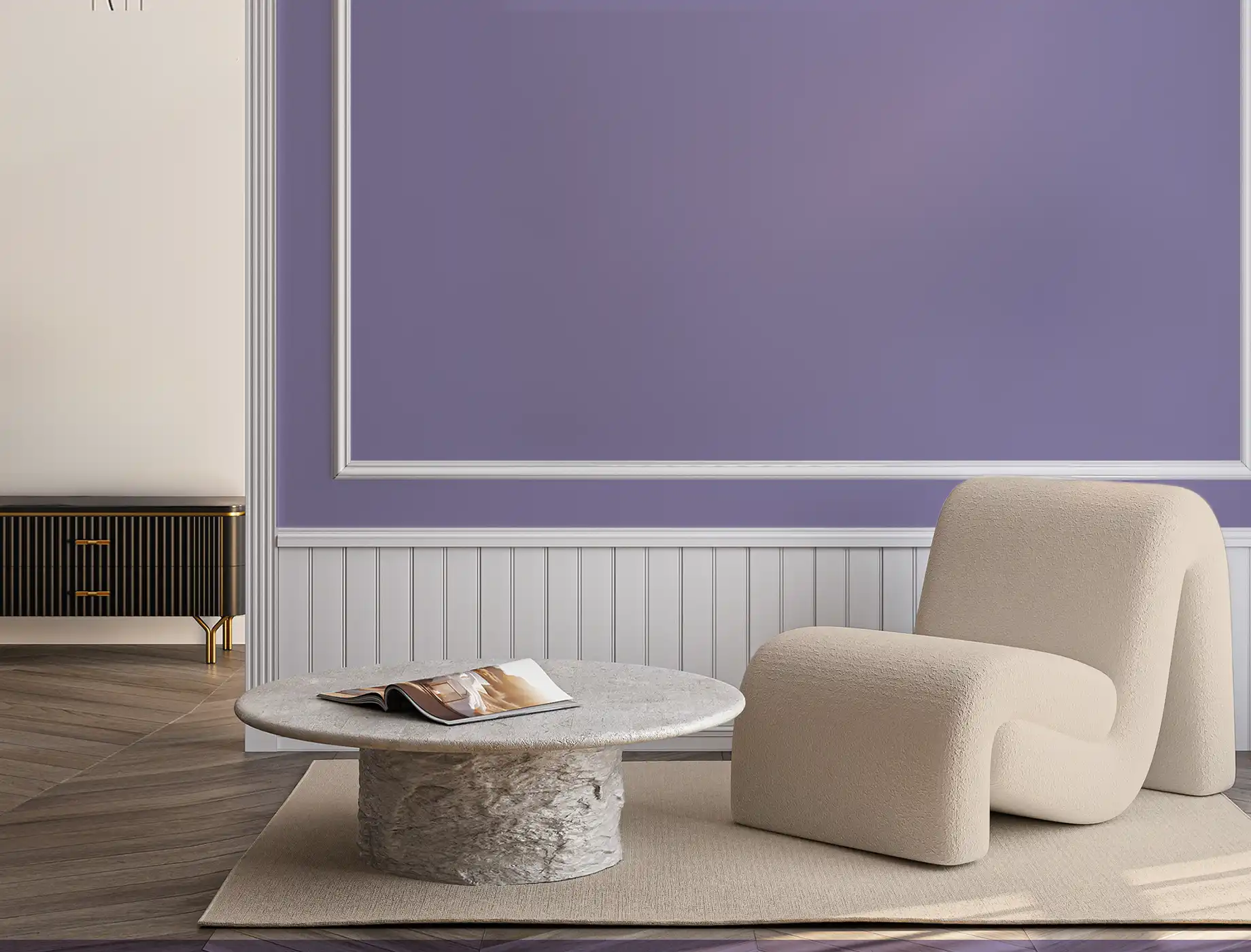
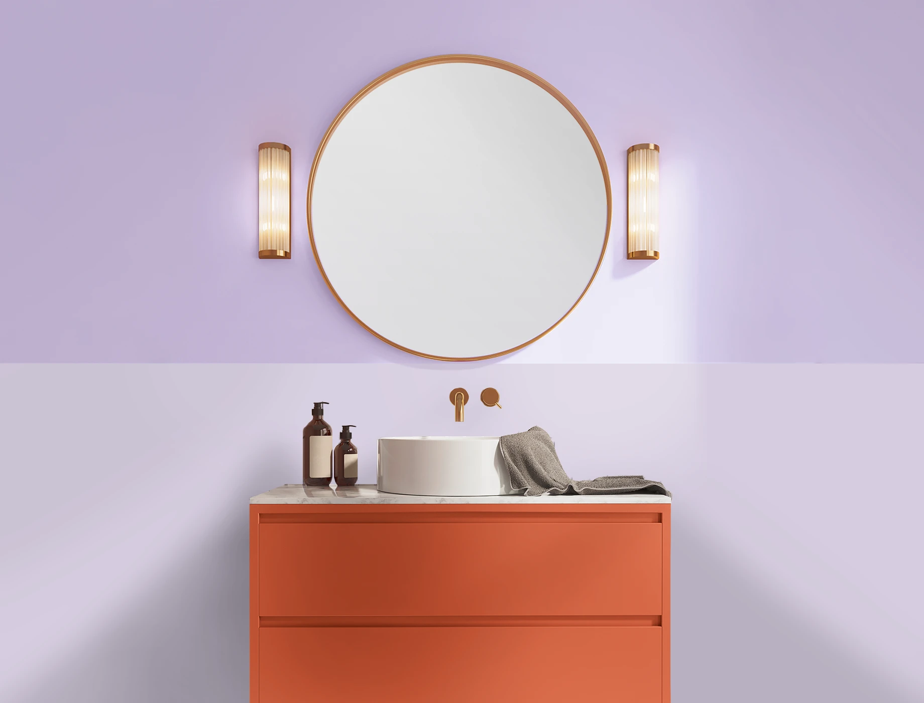
pale pansy
PB 1411P
plum frost
PB 1417P
heather ashes
PB 1455P

deep meditation
N 1960D
Toasted Almond
N 3132T
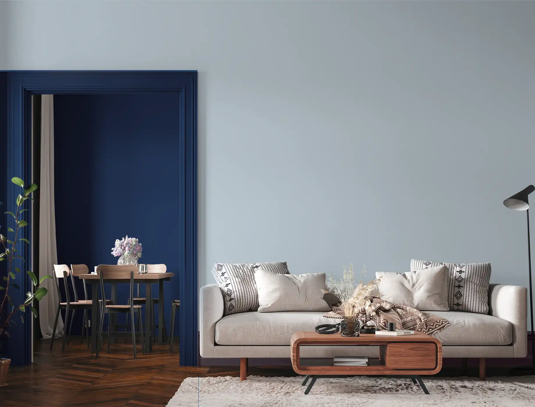
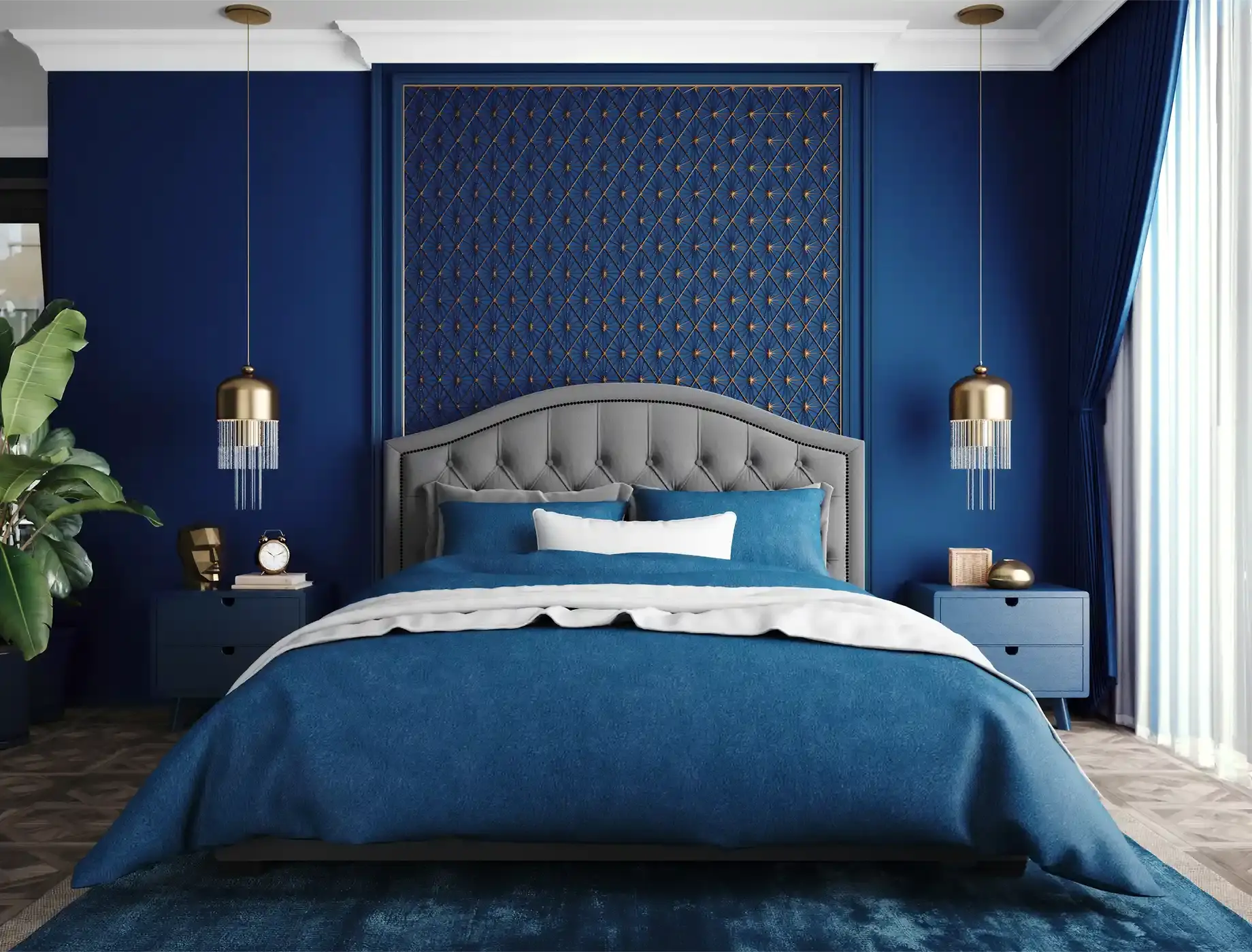
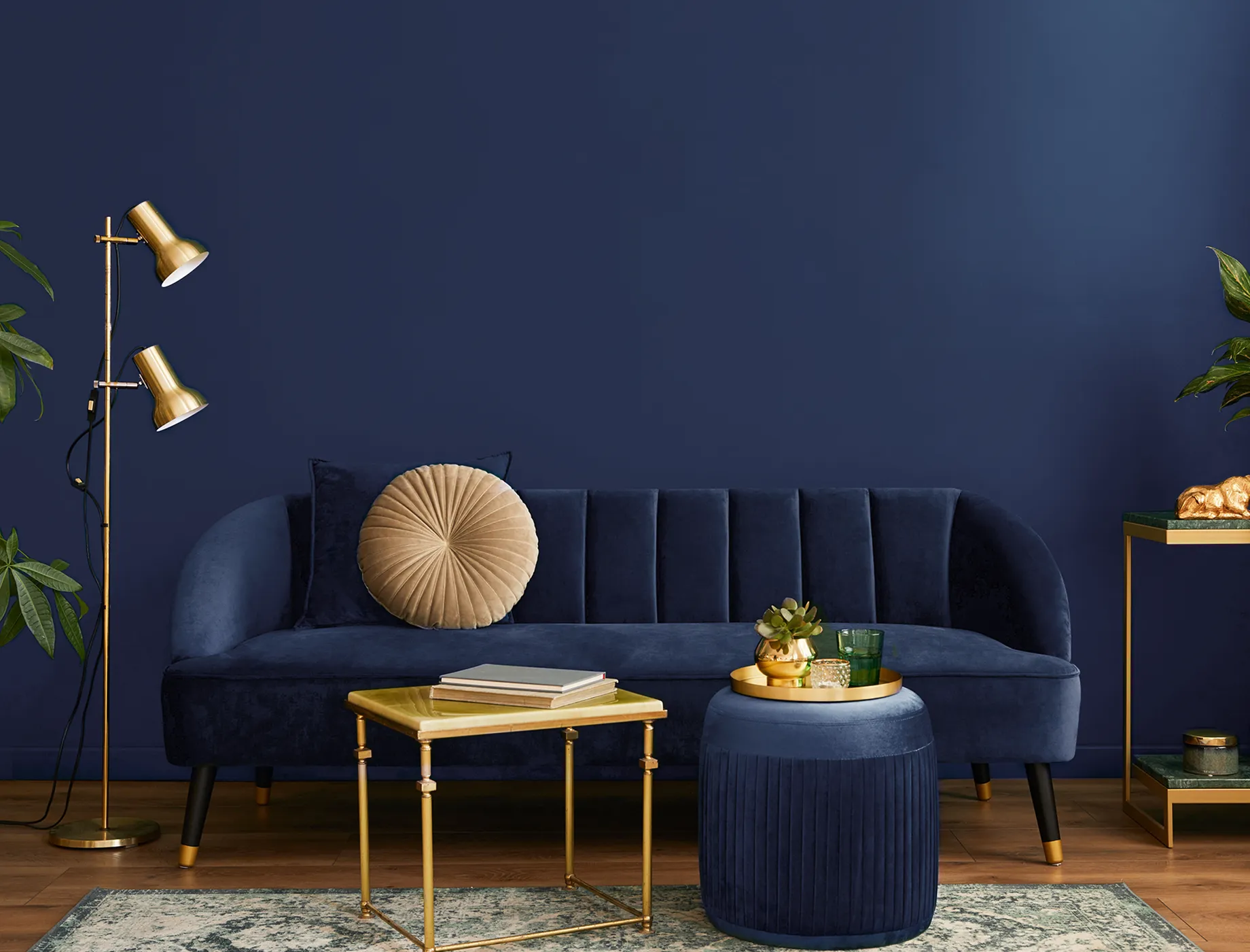
colbalt blue
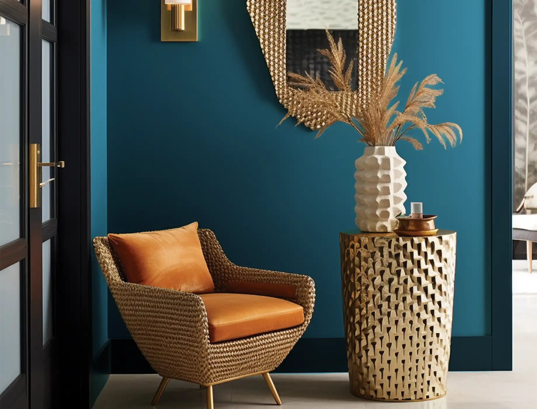
fountain blue
N 1968D
blue crotchet
PB 1516P
colbalt blue
cloud wisp
PB 1509P
benedict blue
PB 1512A
colbalt blue
dynasty
PB 1505A
morsels
N 1863D
benedict blue
dark secret
PB 1561A
Handpainted
N 1861T
Berry Scent
marablelle
PB 1498A
capitol's gold
YO 1169D
Berry Scent